Wednesday, 1 February 2012
Band Designs

 Almost 3D look made only by shading the right places. Well as the migrophone looks like it would come out of the page, it also could be added to any other designs.
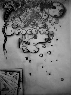
  Process band I have only used one colour from their portrait photo. It is also trasformed into the stencil technique using computer 'Photoshop'.
Artist - Matt Nredle

He began freelancing in 2007 and carried on throughout University, in which time he worked with many hogh profile clients such as Nike, The Big Chill Festival, Clash Magazine, Chelsea Flower Show, Hugo Boss, CNN and many more. Matt is inspired by the minute and insignificant things he see around and strive to create meaningful, complex and often bizarne pieces. Also he gets his inspiration from several Art movements and people like, Roman Clieslawick, Salvador Dali, Escher, Massimo Vignell, Saul Bass, Milton Glaser, Surrealism and many other.
''I' am abstract in my means of communicating ideas, not because its ''trendy'', but because I want people to really think about and analyze what they are viewing.''
Artist - David Carson
His work mainly represents many words poet onto each other or spread around that makes a line or enen sometimes a drawing. He uses really simple texture of letter and imahes that can be noticed how careful and detail he works on. He uses really fade colours, non bright or warm where more he can concentrate onto the details. I like how the work come out but I dont really understand the meaning of the words he put together.

Artist - Josef Muller Brockmann
Josef Muller - Brockmann was a Swiss graohic designer and teacher, born on 9 of May, 1914 in Rapperswil until 30 of August, 1996. He studied architecture, design and history of art at University and Kunstgewarbeschile in Zurich. In 1936 he opened his zurich studio specialising in graphic design, exhibition design and photography. Josef produced concert posters for the Towhalle in Zurich, at year 1966 he was appointed European design consultant to IBM. He is recognised for his simple designs and his clean use typography, notable Grotesk, shapes and colours which inspires many graphic designers in the 20st century.
Two of the designs he done I choose from to take inspiration from by they simplety and the difference from others.
Artist - Mr Brainwash
Artist - Stina Persson
Visual Recording
Orange Logo
In the advertise a variety of different types of outline phones is arranged by overlapping on each other so that it makes a shape of circle. colours used for the outlines are white and orange, depends on the place. The shape give you thought about orange as the fruid, network of mobile connection and glbe where the space of land is underlined using white outlines of phones. The rest is covered with orange colour so that i catch you attantion well as it makes you think about orange as a fruid. Through using black bacground, the colours are contrasting with each other what is the another thing that catch you eye. There is no shadow used or any difficult shapes what makes it understand really clearly and also make it interesting for the audience. By the texture used and whole of the simple bits added, the text I think of that is the message is ' The world is conected with orange' what tells you that many people around the world are using orange network to each other, not matter how far it is.
What really did interest me in this design is how the designer consider all the parts that he used. The things that are not needed is not used, only the shapes that comminicates with audience and can send the clear message, sonething somple but also fascinating.
Subscribe to:
Comments (Atom)


